
Test Tip
When writing a Task 1 answer, it is important to describe numbers and data in different ways to avoid repetition. You will be given credit for doing this, as it will show you have a wider range of
How to Write an IELTS Writing Task 1
On the following pages you can see model answers for IELTS writing task 1 questions.
There are examples of all the different types of task which include line graphs, pie charts, tables, processes, diagrams and maps.
First, on this page, you’ll get an overview of how to answer a task 1.
vocabulary.
You should spend about 20 minutes on this task.
Answers will always vary depending on the type of graph or diagram, and the type of language will vary, but there is a certain structure that they all follow.
Once you have studied the general structure, you can view other examples by following the links in the right hand column.
How do I answer an IELTS writing task 1?
To analyse this, we’ll look at a line graph. Look at the following question and the graph.
You should spend about 20 minutes on this task.
The line graph below shows changes in the amount and type of fast food consumed by Australian teenagers from 1975 to 2000.
Summarize the information by selecting and reporting the main features and make comparisons where relevant.
Write at least 150 words.
There are three basic things you need to structure an IELTS writing task 1.
- Introduce the graph
- Give an overview
- Give the detail
We’ll look at each of these in turn.
1) Introduce the Graph
You need to begin with one or two sentences that state what the IELTS writing task 1 shows. To do this, paraphrase the title of the graph, making sure you put in a time frame if there is one.
Here is an example for the above line graph:
The line graph compares the fast food consumption of teenagers in Australia between 1975 and 2000, a period of 25 years.
You can see this says the same thing as the title, but in a different way.
2) Give an Overview
You also need to state what the main trend or trends in the graph are. Don’t give detail such as data here – you are just looking for something that describes what is happening overall.
One thing that stands out in this graph is that one type of fast food fell over the period, whilst the other two increased, so this would be a good overview.
Here is an example:
Overall, the consumption of fish and chips declined over the period, whereas the amount of pizza and hamburgers that were eaten increased.
This covers the main changes that took place over the whole period.
You may sometimes see this overview as a conclusion. It does not matter if you put it in the conclusion or the introduction when you do an IELTS writing task 1, but you should provide an overview in one of these places.
3) Give the Detail
You can now give more specific detail in the body paragraphs.
When you give the detail in your body paragraphs in your IELTS writing task 1, you must make reference to the data.
The key to organizing your body paragraphs for an IELTS writing task 1 is to
group data together where there are
patterns.
To do this you need to identify any
similarities and
differences.
Look at the graph – what things are similar and what things are different?
As we have already identified in the overview, the consumption of fish and chips declined over the period, whereas the amount of pizza and hamburgers that were eaten increased.
So it is clear that pizza and hamburgers were following a similar pattern, but fish and chips were different. On this basis, you can use these as your ‘groups’, and focus one paragraph on fish and chip and the other one on pizza and hamburgers.
Here is an example of the first paragraph:
In 1975, the most popular fast food with Australian teenagers was fish and chips, being eaten 100 times a year. This was far higher than Pizza and hamburgers, which were consumed approximately 5 times a year. However, apart from a brief rise again from 1980 to 1985, the consumption of fish and chips gradually declined over the 25 year timescale to finish at just under 40.
As you can see, the focus is on fish and chips. This does not mean you should not mention the other two foods, as you should still make comparisons of the data as the questions asks.
The second body then focuses on the other foods:
In sharp contrast to this, teenagers ate the other two fast foods at much higher levels. Pizza consumption increased gradually until it overtook the consumption of fish and chips in 1990. It then levelled off from 1995 to 2000. The biggest rise was seen in hamburgers as the occasions they were eaten increased sharply throughout the 1970’s and 1980’s, exceeding that of fish and chips in 1985. It finished at the same level that fish and chips began, with consumption at 100 times a year.
Full Model Answer:
The line graph compares the fast food consumption of teenagers in Australia between 1975 and 2000, a period of 25 years. Overall, the consumption of fish and chips declined over the period, whereas the amount of pizza and hamburgers that were eaten increased.

In 1975, the most popular fast food with Australian teenagers was fish and chips, being eaten 100 times a year. This was far higher than Pizza and hamburgers, which were consumed approximately 5 times a year. However, apart from a brief rise again from 1980 to 1985, the consumption of fish and chips gradually declined over the 25 year timescale to finish at just under 40.
In sharp contrast to this, teenagers ate the other two fast foods at much higher levels. Pizza consumption increased gradually until it overtook the consumption of fish and chips in 1990. It then levelled off from 1995 to 2000. The biggest rise was seen in hamburgers as the occasions they were eaten increased sharply throughout the 1970’s and 1980’s, exceeding that of fish and chips in 1985. It finished at the same level that fish and chips began, with consumption at 100 times a year.
(194 words)
Academic task 1 – trend vocabulary
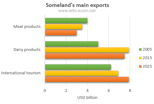
The chart below gives information about Someland’s main exports in 2005, 2015, and future projections for 2025.
Summarise the information by selecting and reporting the main features, and make comparisons where relevant.
Write at least 150 words.
Model answer
This bar chart illustrates the performance of Someland’s primary exports in 2005 and 2015. It also indicates future projections for 2025. According to the data, it seems likely that international tourism will become the dominant industry, although dairy exports will remain strong. In 2005, we can see that tourism was the greatest exports earner of the three industries, with revenue standing at just over $6 billion.
This figure has increased slightly, so that now, in 2015, it has reached almost $7 billion. It is estimated that international tourism will continue to grow, so that by 2025, it will be earning around $8 billion for the country. In 2000, dairy exports were worth around $5 billion, but since then there has been a dramatic increase, and sales for this year are approximately $8 billion. Experts are predicting that exports in this area may fall slightly, so a figure of $7.5 billion is expected for 2025. Meat products are the third key industry in Someland, but sales have dropped since 2000 and now stand at $3.5 billion. It is expected that sales will continue to decrease in the future.
(187 words)
IELTS Writing Task 1
Test Tip
This chart does not provide information about population size. If you choose to include information in your answer that is not given in the task, you will not get extra marks. In fact, it may be considered irrelevant and you may be penalised if you make detailed comments about information that is not provided in the chart.
You should spend about 20 minutes on this task.
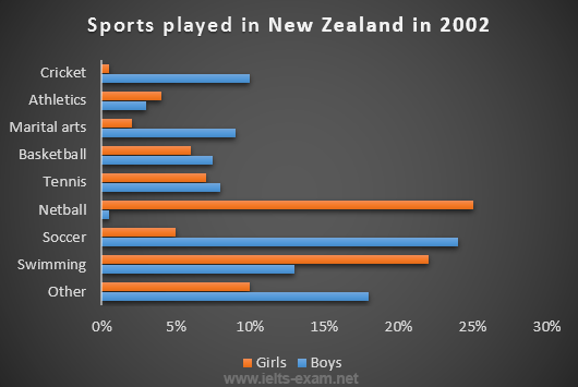
The chart below gives information about the most common sports played in New Zealand in 2002.
Summarise the information by selecting and reporting the main features, and make comparisons where relevant.
Write at least 150 words.
Model answer
The bar graph provides information about the most Common sports played in New Zealand in 2002. It gives figures for both boys and girls and clearly shows that their participation in sports is fairly equal. However, their sporting preferences tend to be different.
According to the graph, the most popular sport among girls is netball, with participation rates reaching 25 per cent. A similar percentage of boys prefer soccer, which is clearly their favourite sport. Ten per cent of boys also enjoy playing cricket but hardly any girls take part in this game. While swimming is popular among both boys and girls, fewer boys participate in this sport – about 13 per cent compared to approximately 22 per cent of girls.
Other sports such as tennis, basketball and martial arts have lower levels of popularity, and a significant percentage of boys and girls say they enjoy sports not referred to on the chart.
(153 words)
IELTS Writing Task 1
IELTS Writing Guide
1) This is a formal piece of writing.
2) Avoid using contractions (e.g. write it has decreased not it’s decreased).
3) Avoid using very informal vocabulary (e.g. write it has become more popular not it has gotmore popular).
4) Avoid using very informal punctuation, such as exclamation marks.
5) Try to use linking devices, such as In contrast, However, Moreover, Similarly, to connect points.
You should spend about 20 minutes on this task.
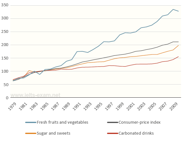
The graph below shows relative price changes for fresh fruits and vegetables, sugars and sweets, and carbonated drinks between 1978 and 2009.
Summarise the information by selecting and reporting the main features, and make comparisons where relevant.
Write at least 150 words.
 Data are from the Bureau of Labor Statistics and represent the U.S. city averages for all urban consumers in January of each year.
Read the following model answer. Complete the answer by filling the gaps with a word from the box below.
| periodic |
period |
temporarily |
remained |
and |
| steady |
steadily |
by |
from |
trend |
Model answer
The graph shows changes in the price of fresh fruits and vegetables, sugar and sweets, and carbonated drinks over a thirty-year ………. in the US between 1979 ………. 2009. The graph also shows the general ………. in the consumer price index during this time.
While the consumer price index showed a slow and ………. increase from 1979 to 2009, the same cannot be said for the price of carbonated, or soft drinks. After rising briefly between 1979 and 1981, they ………. fairly constant until 1999, when the price did begin to increase slowly.
In contrast, there was a marked difference in the price of fresh fruits and vegetables, which, despite………. fluctuations, rose ………. throughout this period. In fact, fresh food prices only levelled out………. between 1990 and 1992 and again ………. 2000 to 2001. However, ………. 2008 the price had increased by more than 300%
IELTS Writing Task 1
IELTS Writing Guide
1) This is a formal piece of writing.
2) Avoid using contractions (e.g. write it has decreased not it’s decreased).
3) Avoid using very informal vocabulary (e.g. write it has become more popular not it has gotmore popular).
4) Avoid using very informal punctuation, such as exclamation marks.
5) Try to use linking devices, such as In contrast, However, Moreover, Similarly, to connect points.
You should spend about 20 minutes on this task.
The graph below shows relative price changes for fresh fruits and vegetables, sugars and sweets, and carbonated drinks between 1978 and 2009.
Summarise the information by selecting and reporting the main features, and make comparisons where relevant.
Write at least 150 words.
 Data are from the Bureau of Labor Statistics and represent the U.S. city averages for all urban consumers in January of each year.
Read the following model answer. Complete the answer by filling the gaps with a word from the box below.
| periodic |
period |
temporarily |
remained |
and |
| steady |
steadily |
by |
from |
trend |
Model answer
The graph shows changes in the price of fresh fruits and vegetables, sugar and sweets, and carbonated drinks over a thirty-year period in the US between 1979 and 2009. The graph also shows the general trend in the consumer price index during this time.
While the consumer price index showed a slow and steady increase from 1979 to 2009, the same cannot be said for the price of carbonated, or soft drinks. After rising briefly between 1979 and 1981, they remained fairly constant until 1999, when the price did begin to increase slowly.
In contrast, there was a marked difference in the price of fresh fruits and vegetables, which, despiteperiodic fluctuations, rose steadily throughout this period. In fact, fresh food prices only levelled out temporarily between 1990 and 1992 and again from 2000 to 2001. However, by 2008 the price had increased by more than 300%.
IELTS Writing Task 1
IELTS Writing Guide
1) This is a formal piece of writing.
2) Avoid using contractions (e.g. write it has decreased not it’s decreased).
3) Avoid using very informal vocabulary (e.g. write it has become more popular not it has gotmore popular).
4) Avoid using very informal punctuation, such as exclamation marks.
5) Try to use linking devices, such as In contrast, However, Moreover, Similarly, to connect points.
You should spend about 20 minutes on this task.
The graph below shows relative price changes for fresh fruits and vegetables, sugars and sweets, and carbonated drinks between 1978 and 2009.
Summarise the information by selecting and reporting the main features, and make comparisons where relevant.
Write at least 150 words.
 Data are from the Bureau of Labor Statistics and represent the U.S. city averages for all urban consumers in January of each year.
Read the following model answer. Complete the answer by filling the gaps with a word from the box below.
| periodic |
period |
temporarily |
remained |
and |
| steady |
steadily |
by |
from |
trend |
Model answer
The graph shows changes in the price of fresh fruits and vegetables, sugar and sweets, and carbonated drinks over a thirty-year period in the US between 1979 and 2009. The graph also shows the general trend in the consumer price index during this time.
While the consumer price index showed a slow and steady increase from 1979 to 2009, the same cannot be said for the price of carbonated, or soft drinks. After rising briefly between 1979 and 1981, they remained fairly constant until 1999, when the price did begin to increase slowly.
In contrast, there was a marked difference in the price of fresh fruits and vegetables, which, despite periodic fluctuations, rose steadily throughout this period. In fact, fresh food prices only levelled out temporarily between 1990 and 1992 and again from 2000 to 2001. However, by 2008 the price had increased by more than 300%.
IELTS Writing Task 1
Writing Exam Tip
When you first see a bar chart, ask yourself the following questions:
1) What do the numbers on the vertical/horizontal axis measures?
2) How is the information grouped on the other axis?
3) What do the different shades of the bars show?
4) When was the data collected?
The answers will give you the essential information for understanding it. Make sure you know which units are being used to measure quantities.
You should spend about 20 minutes on this task.
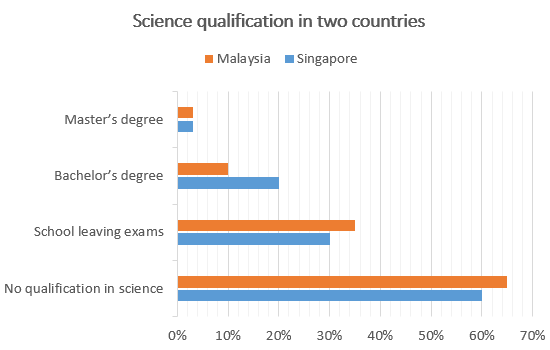
The chart below gives information about science qualifications held by people in two countries.
Summarise the information by selecting and reporting the main features, and make comparisons where relevant.
Write at least 150 words.
Model answer
The bar chart illustrates the percentage of people who hold a science qualification in Singapore and Malaysia. A prominent feature is that a significantly low percentage of people hold science qualifications, that is Master’s and Bachelor’s degrees in science from university level studies in both countries. Less than 5% of people hold a qualification in science at Master’s degree level in both Singapore and Malaysia.
There is a significant difference in the percentage of people holding science qualifications at Bachelor level between the two countries; while this number is 20% in Singapore, in Malaysia it is a mere 10%. The percentage of people with school leaving exams in science is slightly higher in Malaysia than in Singapore. 35% of people in Malaysia have a science qualification at this level, whereas the number in Singapore is 5% lower. Finally, more than half the people in both countries hold no science qualification at all.
(152 words)
Academic IELTS Writing task 1 Sample 1 – Male and female workers in 1975 and 1995 in several employment sectors of the republic of Freedonia
Write a report for a university teacher describing the information shown.
» You should write at least 150 words.
» You should spend about 20 minutes on this task.


Sample Answer 1:
The given diagrams compare the male and female employment status in six different job sectors in two different years – 1975 & 1995. As is seen from the given illustration, men were well ahead of women in all the job sectors in Freedonia in 1975. However, the scenario changed in the 1995 and women did a remarkable progress in their professions.
According to the given diagrams, men in Freedonia were well ahead of female in manufacturing, finance/banking, wholesale & retail trade, defence and non-defence sectors. In manufacturing more than 600 male employees could be seen against only 300 female employees. Except in communication sector, the proportion of male employees was far greater than that of females. Among the given job sectors, the public /non-defence sector had the highest number of employees while the defence sector had the least number of employees.
After 20 years, women showed an outstanding advancement in the job sectors and they went well ahead of men in communication, wholesale & retail trade sectors. They become almost equal in number in finance and banking jobs while the gap between male and female employees’ numbers reduced in defence jobs. The only sector that was still male dominant was manufacturing and the job ratio in this sector remained almost same as it was 20 years earlier.
Sample Answer 2:
The given graphs provide data on the workforce in six different professions in the republic of Freedonia in 1975 and 1995. As is observed, the graphs illustrate the progress of empowering women in the work market over the twenty years, even the number of females exceeded the number of males in some work fields.
In 1975, the number of employed men was considerably higher compared to the number of women in all sectors, in particular, manufacturing, finance and banking and public sector (defence). By 1995 there was a significant increase in the number of working females in communication, finance and marketing and wholesale and retail trade, where the number of employed women in these sectors was around 250, 120 and 550 out of thousands respectively and it rose by approximately 300 out of thousand in each sector. Taking into consideration the number of women surpassed the number of men in communication and wholesale and retail sectors, it is evident that women empowerment in employment sectors in Freedonia had significantly progressed in the given period.
Sample Answer 3:
The given line graphs illustrate the number of male and female workers in various employment sectors of the republic of Fredonia in the year 1975 and 1995. The first point to note is that the highest number of male and female workers were occupied in the public sector and wholesale and retail trade sector in both years.
Public sector occupied the same number of employees in both two years that is 840 males and 640 females. Wholesale and retail trade sector stands close behind with 650 male and 460 female employees in the year 1975, while a slight reverse order in the year 1995 with 800 females and 650 males. Manufacturing section consumes almost an equal number of employees in both years with 600 males and half of its females. Interestingly, almost an equal number of employees in communication sector in the year 1975 with 240 and 250 females and males respectively, changed to its double in female workers and with the same number of male workers in the year 1995. This same trend was shown in finance and banking sector. However, defence public sector occupied the lowest number with 10 female and 210 male workers in the year 1975 and 100 females and its double male workers in the year 1995.
In conclusion, it is clear from the graphs that, there are fluctuations in the number in both years. But male employees are more compared to females in almost all the sectors in the given years.
(Approximately 238 words )
Model Answer 4:
The provided illustrations compare the male and female workers in different employment sectors in Freedonia over 20 years of time by providing data for the years 1975 and 1995. As is observed from the given line graphs, women were far behind in employment in Freedonia in 1975 but within 20 years they made remarkable progress almost in all sectors and went well ahead of men in communications and wholesale & retail trade sectors.
The graphs compare the number of male and female workers in 6 different sectors of Freedonia per thousand. In 1975, more men than women were employed in almost all the mentioned sectors of job categories. For instance, approximately 650 men were employed in manufacturing related jobs compared to only 300 women per thousand of total employees in the same sectors. In almost all other cases, the numbers of male employees were much higher than the women and in communication sectors men were bit ahead than female in their employment ration. After 20 years, in 1995, women made outstanding progress in Freedonian job sectors. For instance, in communication sectors almost 600 female were employed compared to 300 male workers per thousand. Women went ahead of men in wholesale & retail trade sectors too. Except for the public sectors (non-defence) women hold the trends of progress compared to men in all other sectors. In 1975 only about 40 women worked in defence sectors and this number grew to more than 100 per thousand after 20 years.
In summary women did remarkable progress in Freedonian job fields over 20 years and they went ahead of men in many job sectors.
(Approximately 270 words)
(These two model answers can be followed as examples of a well-written answer. However, please note that this is just one example out of many possible approaches.)
Sample Answer 5:
The provided line graphs compare the employment history of men and women in 1975 and 1995 dividing in six major sectors namely: manufacturing, communications, finance/ banking, wholesale & retail trade, non-defence public sectors and defence public sectors. As is observed from the given illustration, significant changes have been made in women’s employment and women appear to have made remarkable improvements in almost the entire job sectors in Freedonia and in some sectors women went well ahead of men.
Initially, in 1975, men were notably ahead of women in every sector of employment. For example, in communication sector about 260 men worked against 220 women in every thousand employees. Twenty years later, though the number of men remained unchanged, the number of women rose to over 550 in one thousand. A similar trend can be seen in the wholesale and retail trade sector, where the number of women rose from about 550 to almost 800 in every 1000 employees of this sector two decades later. The number of men in this sector remained stable over the period, at around 700 / thousand.
Women also made their prominence in both the finance/ banking industries and in the defence-related public sector during this period. Where 125 women among one thousand employees worked in finance & banking institutions in 1975, this number increased to 450 by 1995. The number of men grew only marginally from 425 to 480 over the same period. In defence sector, the number of men declined from 225 to 200 per thousand, while the number of women rose from 25 to over 100 per thousand. Two sectors that remained almost stable in terms of men and women employee ration are manufacturing and public sector. In manufacturing, about 300 women and 650 men worked in both surveyed years, and in public sector (non-defence), which employed 650 women and 850 men.
In conclusion, we can say that women appear to have made gains in the workforce in Freedonia and in some sectors they went well ahead compared to men.
Tips for Answering this Academic Writing Task 1 Question:
1. Two line graphs are provided in this writing task 1, so start the introduction part as follows:
The given line graphs provide data on…..
Do not use,
‘the give line graph shows…’ as there are more than one graphs present in this question.
2. The two line graphs compare the number of male and female employees in 6 employment sectors in Freedonia. The first graph shows the data for the year 1975 while the second graph shows data for the year 1995.
3. The first graph shows that the male employees were well ahead in all the job sectors in Freedonia. But after 20 years that scenario changed and women did a remarkable progress in the job sectors.
4. Initially, in 1975, men were higher in number in terms of their involvement in different work sectors. Only in Finance and Banking sector, female were close to the male.
5. After 20 years in 1995, the number of women employees crossed the number of men employees in communications & wholesale & retail trade sectors.
6. In communication sector, the number of women employees reached to 550 per thousand while this number was only 210 per thousand in 1975.
7. Do not only give the numbers of male and female employees in 6 job sectors of Freedonia in 1975 and 1995. Rather make a comparison of the male and female employee numbers and show some of the comparisons for women about how many of them were employed in 1975 and how these numbers have increased in 1995. Keep in mind that the writing expects you to be able to compare the women’s improvement and increasing involvement in job sectors of Freedonia.
Summary of the graphs:
In Freedonia, women’s involvement in major job sectors has increased remarkably in 20 years. Initially, in 1975, they were less in number than the male employees in all the 6 major job sectors. But within 20 years, they did significant progress and have crossed the number of male employees in some sectors.
Sample Answer 6:
The provided line graphs compare the number of male and female workers in 6 broad job sectors of Freedonia. As is presented in the two line graphs, women have made a significant improvement in Freedonian job sectors over the 20 years.
Initially, in 1975, men were ahead in all job sectors than women. In manufacturing job fields, around 220 women were employed while the number of male employees was well over 600 per thousand. Men were ahead of women in terms of their involvement in jobs in all of the mentioned 6 broad sectors. In Finance/ Banking, wholesale & retail trade, non-defense public sector, women were far more behind than their male counterpart. Only in communications sector women were close to men. Among 1000 employees in defence public sector women were less than 50 where men were around 250. The first graph thus depicts the men and women workforce in Freedonia in 1975.
But after 20 years in 1995, the scenario had changed significantly. Women crossed men in terms of their job involvement in communication and wholesale & retail trade. In defence, the number of women workers doubled that the number of 1975, whereas the number of men had decreased to 200. In non-defence sector, the differences had not changed that much but in communications and Finance/ Banking sector women have done significant improvement compared to their number 20 years back.
In summary, women in Freedonia had done a remarkable progress in job sectors and in some cases had superseded their male counterparts.
(Approximately 225 words)
Sample Answer 7:
The line graphs illustrate the number of male and female workers in various sectors in Freedonia in 1975 and 1995. It is evident that manufacturing, trade and non-defence public sector employed most number of people.
From the graph, it is clear that in 1975, male workers were involved in much greater numbers than females especially in manufacturing where about 700 men were involved which was more than twice the number of females. Similarly, men were employed over five times the number of females in banking. In all the other sectors men were considerably ahead in terms of employment in 1975.
Then in 1995 female employment rocketed in communications, becoming almost double of that for males (300). It surpassed the male employment in retail trade as well (800 women per thousand employees). Except in manufacturing where the situation remained the same as 1975, women employment increased significantly in all the other sectors.
Thus it is clear that male employment was much higher in 1975 compared to women but women employment have rocketed through the 20 years and has surpassed the male employment in some sectors.
(Approximately 184 words )
Model Answer 8:
In the year 1975, men have outnumbered female workers in each and every sector in most of the cases the gap between them was very wide except in the case of communication. To start with, in the manufacturing there were around 700 men to a total of 300 women and for finance/banking these numbers were 450 and 150 respectively. Maximum number per thousand employees was in the public sector (900) with least number in defence (only 200). Same was true for women as well with.
In the year 1995, statistics changed drastically and women exceeded in number to men in the field of communication and wholesale & retail trade. They were the maximum in wholesale sector and continue to be least in defence sector. Overall there is no major change for male workers in any sector except in defence where a minute decline in numbers can be seen. There still is a huge gap in male and female workers in the manufacturing sector but in the case of finance, the gap is now narrowed down to almost nill.
(Approximately 172 words )
Model Answer 9:
The graphs give us a brief idea about the various changes that has taken place in 6 different employment sectors in Freedonia based on the population of both male and female sexes from 1975 to 1995. Though there isn’t a major increase in the overall number of employees, some of the individual sectors showed a notable increase in its work population.
The defence sector had the least number of men and women and even though there was a slight variation in the number of women the number of men in this sector remained the same in both the years. Manufacturing at 600 above men, 250 women and public sector apart from defence at 800 above men and 600 above women had no significant changes in both the years whatsoever. Most changes had been in the communication, finance and wholesale sectors with a large increase in the number of people from 1975 to 1995 speaks out in the volume of the interest of the general public towards these sectors. Communication and wholesale sector had seen a huge hike in the number of women even overtaking men in the process.
On these grounds, I conclude by saying the prominence of women in employment sectors in Freedonia is evident when we compare the graph of 1995 and 1975.
(Approximately 172 words
)
Model Answer 10:
As can be seen from the graphs, among all the sectors, non-defence public sector was the most popular working field for both the genders in 1975, in which, the number of males and females was around 900,000 and 700,000 respectively. Interestingly, the figures for both the genders in this sector remained the same even in1995, followed by wholesale and retail sector, where the rate of women employees was 570,000 in1975 which rose to 800,000 after 2 decades whereas the figures for their counterparts worked in the same sector stayed at a constant figure of 800,000 throughout the period.
Likewise, in the field of manufacturing, the number of males and females had no change after 20 years from 700,000 and 300,000 respectively. Noticeably, the number of men occupied in the field of communication and banking /finance remained steady during the time period at 300,000 and just over 400,000 correspondingly; whilst the figures for female employees in communication sector underwent a threefold increase from about 300,000 by 1995.
Similarly, in the banking sector, women had a fourfold rise to almost 450,000. It can be seen that only 25,000 women worked in the defence/ public sector in1975, while the figures for men was more than 225,000. However, the rate of the former rose by 4 times and reached 100,000 after 20 years whereas the figures for the latter had a fall to 200,000.
To conclude, the occupational data for men had no considerable change whereas massive changes took place in the case of women workers over a 20 year period.
(Approximately 256 words
)
]]>


 In 1975, the most popular fast food with Australian teenagers was fish and chips, being eaten 100 times a year. This was far higher than Pizza and hamburgers, which were consumed approximately 5 times a year. However, apart from a brief rise again from 1980 to 1985, the consumption of fish and chips gradually declined over the 25 year timescale to finish at just under 40.
In sharp contrast to this, teenagers ate the other two fast foods at much higher levels. Pizza consumption increased gradually until it overtook the consumption of fish and chips in 1990. It then levelled off from 1995 to 2000. The biggest rise was seen in hamburgers as the occasions they were eaten increased sharply throughout the 1970’s and 1980’s, exceeding that of fish and chips in 1985. It finished at the same level that fish and chips began, with consumption at 100 times a year.
(194 words)

 The trend vocabulary I am going to suggest may seem very basic. It does, however, allow you to say the same thing in up to 6 different ways.That’s good.
Tip: if you find yourself repeating a word, try changing the form of it from a verb to a noun
You should also note that, even this basic language, there are a variety of grammar problems that cause many candidates problems. That’s bad.


 Note how these two sentences mean exactly the same:


 Data are from the Bureau of Labor Statistics and represent the U.S. city averages for all urban consumers in January of each year.
 Data are from the Bureau of Labor Statistics and represent the U.S. city averages for all urban consumers in January of each year.
 Data are from the Bureau of Labor Statistics and represent the U.S. city averages for all urban consumers in January of each year.


Comments
Academic IELTS Writing task 1 Sample 2 – Eating sweet foods produces acid in the mouth which can cause tooth decay
Describe the information below and discuss the implications for dental health. »You should spend about 20 minutes on this task. »You should write at least 150 words.(Approximately 186 words)
Sample Answer 2: The provided line graph shows the acid level of our mouth which is created from consumption of fruit sugar, cane sugar & honey and compares their effects on our tooth decay. When the pH level in the mouth is above 5.5, acidity remains in such a level that teeth are unlikely to be in danger from decay. Sweet foods, however, cause pH in the mouth to drop for a time, and the longer the pH levels remain below 5.5, the greater the possibility for decay to occur. The illustration compares the fruit sugar, cane sugar and honeys, which are the most common ingredients of sweet foods, causes the pH level to drop below the danger level after 5 minutes. Among these 3 sweet items, cane sugar decrease the pH level most quickly and causes to remain the level under the danger level for the longest period (over 30 minutes) and thus produce the greatest risk among the three. After consuming the cane sugar, the pH level drops to level 3.5 and remains there for over half an hour. On the other hand, fruit sugar causes the acidity level of mouth to fall under pH level 4 in 5 minutes and remains under threat level for 20 minutes. Finally the honey appears to be less risky among the three causes the pH level to drop to 4.7 in 5 minutes and proceed to above pH 5.5 level within 15 minutes of consumption. In conclusion all of the sweet items possess the possibility of causing tooth decay and honey and fruit sugar are likely to cause less decay than the cane sugar does. (Approximately 271 words) ( These 2 model answers can be followed as examples of standard answers. However, please note there are other good ways of writing possible good answer.)Tips for answering this Writing Task 1 Question:
1. Please note that the question asks you to “describe the information presented in the graph and also discuss the implications for dental health”. So you have to mention which food items creates more acid level for longer time and are comparatively injurious for teeth. You must classify which food items are comparatively safe as well. First compare the three food items in terms of the acid level they create in mouth and how long this acid level remains in danger level. Then suggest which food items among cane sugar, fruit sugar and honey is comparatively safe and which item/ items are not. 2. Notice the following trends from the given line graphs: a) Higher the acid level, the lower the pH level. b) pH level below 5.5 is dangerous for the tooth as the tooth decay occurs below 5.5 pH level. c) Honey is comparatively safer than other two food items as it decreases the pH level of the mouth slowly and the acid level goes to the safe level very quickly. On the other hand after consuming cane sugar the pH level falls under danger level quickly and remains there for the longest time among the three food items. 3. To answer this question first mention the acid / pH level which occurs the tooth decay and the level when it is safe. Now take the three given food items and mention them individually: how longer it takes to reach the pH level of mouth below 5.5 after consuming this food item and then how longer this level remains under 5.5. Finally suggest which food items are comparatively safer and which are not.Summary of the Line Graph:
After consuming different sweet food items, the acid level of our mouth increases. The higher acid level is presented by the lower pH value. When the pH value gets under 5.5, the tooth decay occurs. Among the given three food items i.e. cane sugar, fruit sugar and honey, the third item (honey) is comparatively safer for our dental health. This is because after consuming all the honey the pH level remains under danger level for about 12 minutes compared to the 20 minutes for the fruit sugar and 31 minutes for cane sugar. This also indicates that the cane sugar is more likely to damage our tooth among the provided three sweet food items.Sample Answer 3: The bar graph illustrates the acid level of mouth after consumption of three different nutrients such as fruit sugar, cane sugar and honey over the period of forty minutes. According to the bar graph, it is obvious that cane sugar is the most acidic nutrient.
After the consumption of cane sugar, acidity level of mount increased sharply in five minutes and reached 3.5 pH level. From now onwards acidity level of mouth decreases steadily and reached the normal level after thirty-five minutes. However, teeth remained in dangerous level more than 25 minutes.
Another acidic nutrient is fruit sugar. After the consumption, pH level of mouth decreased hurriedly and reached 4.25 in five minutes. After that, level of acidity of month reached normal level in 15 minutes. Therefore, teeth remained in dangerous level for 15 minutes. The last and the least acidic nutrient is honey, after the consumption of honey acidity level of mouth increased dramatically in five minutes and reached 5 pH level and then, plateau for 5 minutes and from now onward decreased moderately. However, teeth remained in an acidic environment for 10 minutes.
To conclude, the more hazardous nutrient for teeth is cane sugar because teeth remained in an acidic environment for more than 25 minutes.
(Approximately 208 words)
Sample Answer 4: The given line graph gives information on amount of acid produced in our mouth by eating sugar and honey made from three different resources namely fruit, sugarcane and honey. Also the graph estimates the time taken by them to reach different acid levels which is related to the tooth decay.
The maximum level of acidity produced by sugary content is reached 5 minutes after consuming them reaching up to 3.5 pH for sugarcane, 4 pH for fruit sugar and 5 pH for honey. After this time the acidity level declines for cane and fruit sugar, whereas it is sustained for 10 minutes for honey. Honey takes approximately 15 minutes to reach the pH of 5.5. It is at this pH at which tooth decay is unlikely. Fruit sugar takes 20 minutes and cane sugar takes the maximum time to reach this safety level. After 40 minutes all three sugars reach neutral pH that is 7.
Acidity promotes tooth decay which results in teeth cavities. Proper brushing and mouth washing can eliminate sugar particles and may protect teeth from the hazards of high acid levels.
From the given data it is clear that cane sugar has highest acidity and its acid content above safety level is sustained for the longest period in mouth. Therefore it should be avoided. Honey is the safest sugary food which causes least chances of tooth decay.
(Approximately 230 words ) Model Answer 5: The given line graph gives information on the acid level produced in our mouth decay after consuming fruit sugar, cane sugar and honey and compares the possible implication those three sweet food items have on our tooth decay. As is observed from the given presentation, honey causes the least tooth decay while the cane sugar possesses the possibility of decaying our tooth among the mentioned three sweet foods. The graph shows that different acid level is created in mouth after we consume different sweet food items. High acid level is measured by low pH level and tooth decay is occurred when the pH level goes below the 5.5. After we eat fruit sugar, the pH level of our mouth declines below 5.5 in 5 minutes and remain in danger level until 13 minutes. Similarly Cane sugar causes the pH level to get under pH level 5.5 in 5 minutes but it remains in danger level for more than 30 minutes which shows the fact that can sugar can cause more tooth decay than the fruit sugar. Finally, in 5 minutes the pH level of our mouth reaches to danger level in 5 minutes after we take honey and this level remain in danger zone for about 20 minutes. The comparison of the three sweet items indicate that the honey is comparatively safer for our dental health as it posses the least possibility of tooth decay while cane sugar possesses the most danger to our dental health as it would possibly create the most tooth decay. (Approximately 225 words) Sample Answer 6: The given graph depicts comparison in acid level in mouth after consuming sugar/honey. One axis of graph contains PH level which measures acidic level and the other axis reflects time line after consuming, spaced out equally with 5 minutes gap. As per the graph, tooth decay starts when the PH level falls beneath 5.5 on the scale and it is quite clear that PH level falls rapidly after consuming all three commodities but took least time to recover in case of honey and the maximum is in case of cane sugar. To start with, the PH level is at 7 and begins to decline after consuming each item and the rate at which it falls is maximum in case of cane sugar. It crosses the danger level within a span of 5 minutes and by the end of 5 minute, PH level reaches its lowest point in case of cane sugar i.e. 3.5 and the same for fruit sugar and honey is 4.25 and 4.75 respectively. After 5 minutes has elapsed, the trend line tends to be inverted and from here on the PH level initiate its recovery in case of fruit/cane sugar though it remains at its lowest in case of honey for a further 5 minute period. On reaching 10 minute mark, PH level in case of honey seems to recover at brisk pace taking over the recovery of other items and reaching the safe zone within a span of 15 minutes. Fruit sugar PH level crosses the line before 20 minutes but cane sugar PH level took almost double the time of honey to recover from tooth decay. Honey PH level normalize by the end of 25 minute mark and the same is 32 minutes and 40 minutes in case of fruit sugar and cane sugar respectively. All in all it can be said that Honey is the least acidic food item and the fastest to recover among the three. On the other hand cane sugar is the most acidic and slowest to recover. Model Answer 7: The given line graph illustrates the various acid levels in the mouth related to three different sweet foods such as fruit sugar, cane sugar and honey. The first point to note is that acid levels due to these different sweets are at a level at tooth decay is unlikely to occur both at the time of eating and after 15 minutes of eating. At the moment of eating of three sweets, acid levels are very low and equal at 7 pH. Then after 5 minutes it dropped to a pH of 3.5, 4.5, and 5 by cane and fruit sugar and honey respectively. Acid levels in the mouth gradually decrease and reached to minimum value within half an hour of cane sugar eating. Acid variations in mouth after eating fruit and cane sugar are almost equal for the next 5 minutes and followed by a difference of 1 pH value for the next 20 minutes. However, after 30minutes of eating sugar and cane sugar, pH value raised and reached to 7 and the acid level hit to the lowest level. To sum up, it is clear from the graph that, the given sweets produces high levels of acids in the mouth soon after eating, but reaches to safe level which tooth decay is not likely to occur within 10-15 minutes. Model Answer 8: The provided line graph illustrates the acid level in the mouth which is created from the consumption of cane sugar, fruit sugar, and honey. As is shown in the graph, the higher the acid level, the lower the pH level. It is also illustrated that a pH level less than 5.5 is the stage when tooth decay occurs. It is significant that the initial pH level in our mouth is 7, and it drops the moment we eat sugar. In the first 5 minutes, the graph shows that eating cane sugar results in a major drop in the pH level which reaches 3.5 and then begins to increase very slowly in half an hour. During this phase, tooth decay is most likely to happen. It is almost the same when eating fruit sugar, as the pH level drops to less than 4.5 in 5 minutes, and remains in detrimental level for about 20 minutes. Moreover, the pH level drops to less than 5 when honey is taken, and it is possesses the threat of tooth decay for only 10 minutes. So, honey is the least dangerous among the three kinds of food items. In summary, it appears that cane sugar is the most detrimental one for our dental health while honey is the safest one. Model Answer 9: The given illustration demonstrates the acid level, which is inverse of the pH values, different sweet foods can create in our mouth and their possible implication for our dental health. As is given in the line graph, high acid levels are measured by the low pH level in mouth and the lower the pH level, it is more likely to decay the tooth. According to the line graph, fruit sugar, cane sugar and honey cause different acid levels in human mouth and their impacts last for five to 30 minutes. The pH level below 5.5 is detrimental for our tooth. When we consume honey, the pH level of our mouth decreases to below 5.5 within 4 minutes and that takes around 13 minutes to come out from the danger level. In case of fruit sugar, the pH level goes below 5.5 in 3.5 minutes and remains in danger level for about 20 minutes. Finally when we eat cane sugar, the pH level of our mouth goes in the danger level in 2.5 minutes and remains in danger level for about 32 minutes. In short, honey is the safest sweet food for our dental health while cane sugar is most detrimental for our tooth as it is likely to cause the maximum decay in our tooth.